
Efficiency
Cluster efficiency is available as part of the cluster report. It provides helpful information on CPU and MEM usage in your cluster, letting you assess its efficiency and plan action to reduce overprovisioning. Read on to learn how to use it.
What you can find in the cluster efficiency report
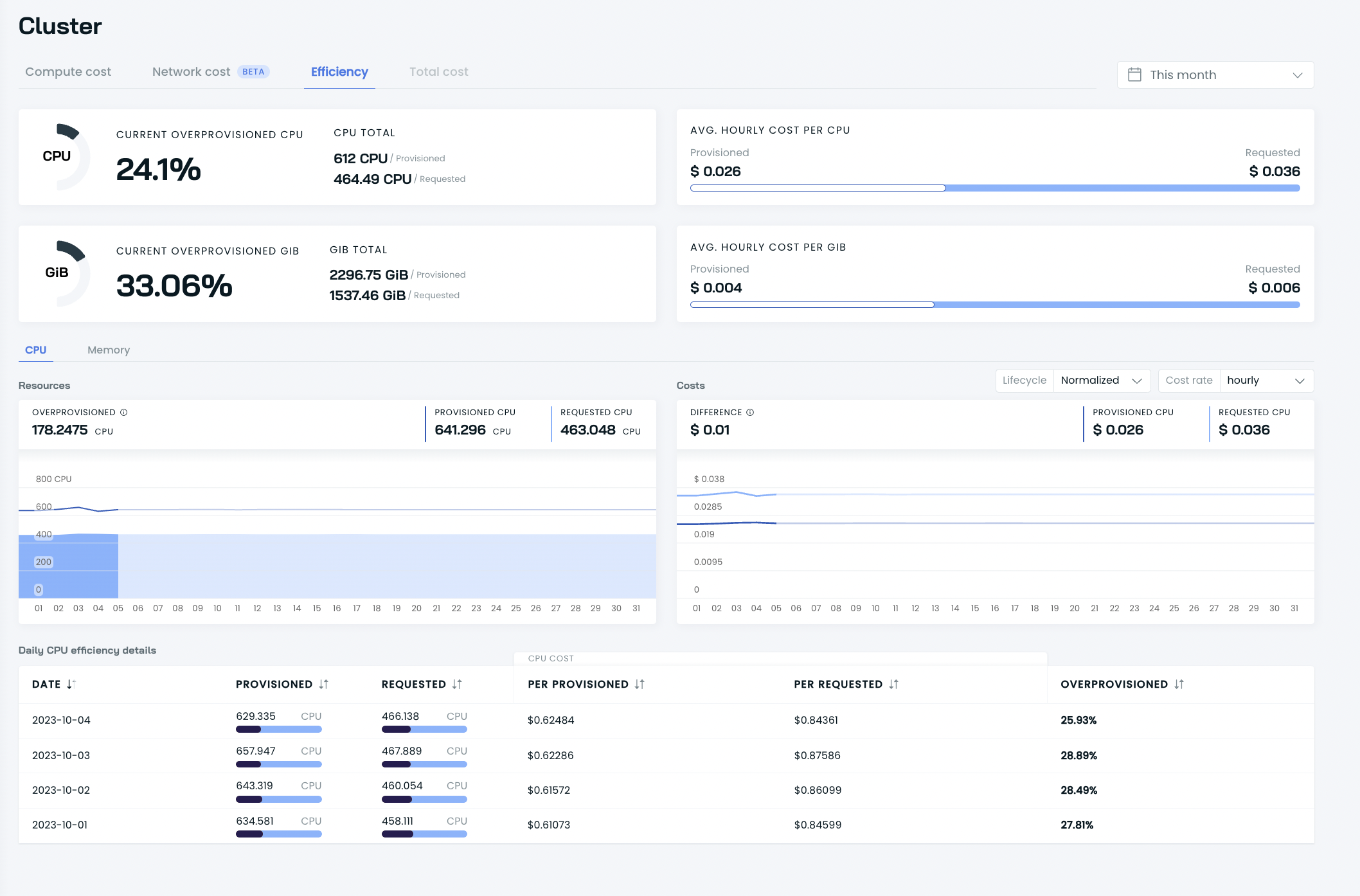
The report delivers insights on your cluster's CPU, memory, and storage (where available) usage and helps you quantify overprovisioning. You can browse current and past data:
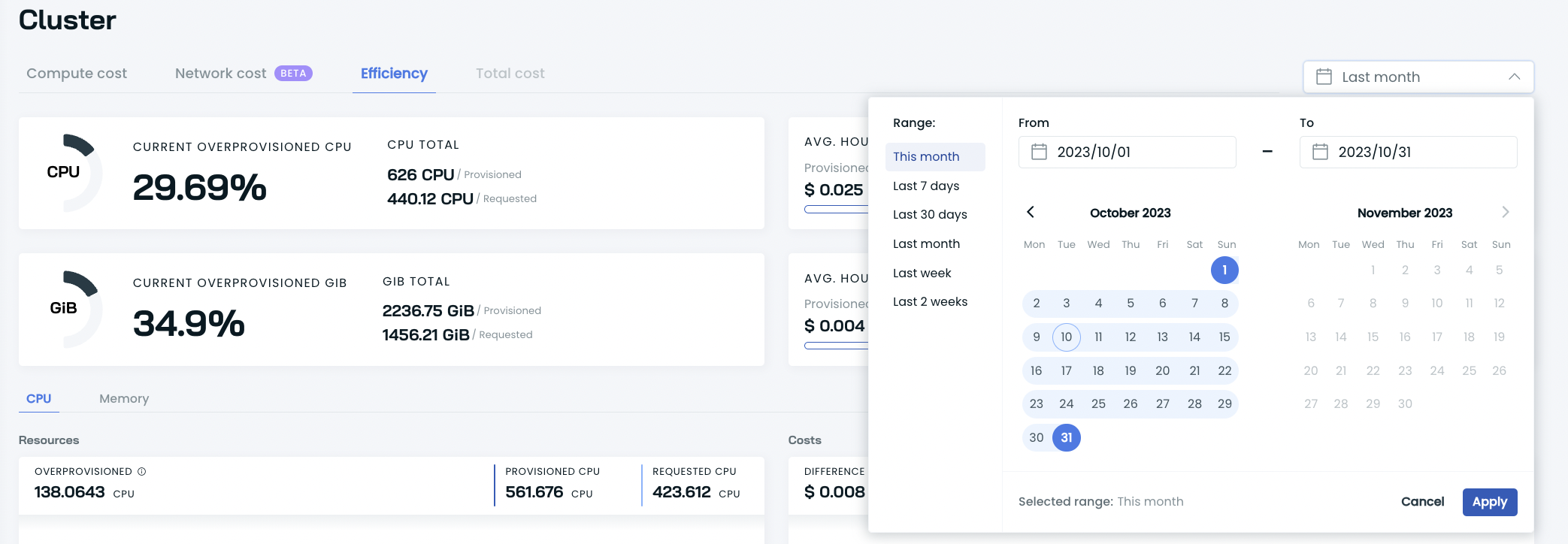
If you select the current period of time, you get real-time insights on your overprovisioned resources.
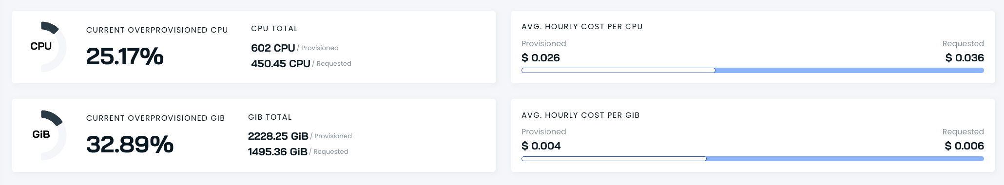
You can also see exact numbers on your cluster's provisioned and requested resources, as well as the average hourly cost per CPU and GiB. These numbers don't change if you select dates in the past.
Then, you can delve into details on your overprovisioned resources and correlate that data with costs, including provisioned and requested CPU/GiB and their difference.
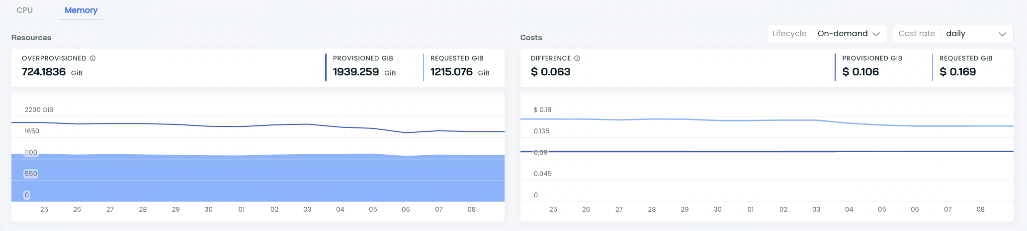
Using the resource offering filter, you can see how these results differ across spot, on-demand, and fallback instances.
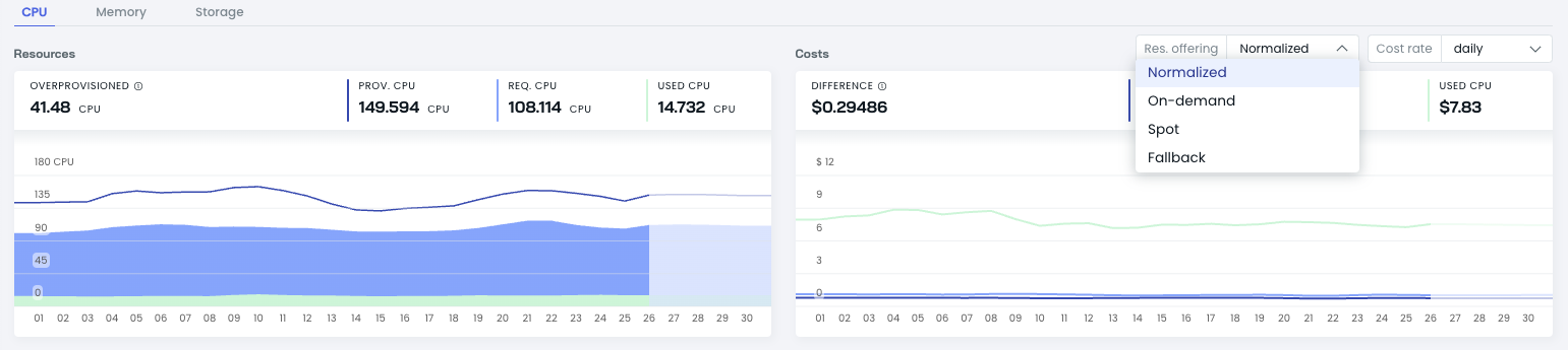
You can also view the selected resource's hourly, daily, and monthly cost rates.
Finally, depending on the type of resource you select in the section above, you can delve into daily CPU and memory efficiency details:
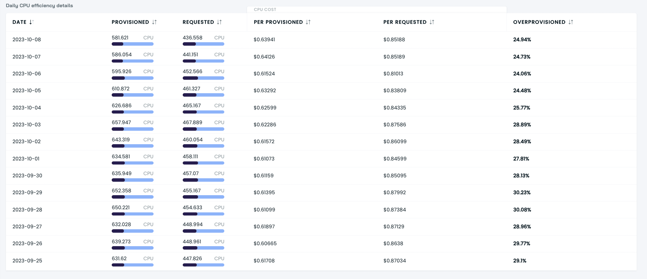
Each day provides calculations of cost per provisioned and requested resource, together with the exact overprovisioning rate reached on that date.
By clicking the arrows by the name of each column, you can sort the results to see the days with the highest/lowest overprovisioning rates or costs per provisioned and requested resources.
Understanding the efficiency metrics
Key resource metrics
The efficiency report tracks three key resource metrics:
- Provisioned Resources: The total capacity allocated by your cloud provider. This represents the full resources you're paying for.
- Requested Resources: The capacity your workloads have asked for through Kubernetes resource requests. This is what your applications have declared they need.
- Used Resources: The actual consumption by your running applications. This represents the resources actually consumed during operation.
These metrics are displayed for both CPU and memory, allowing you to identify potential optimization opportunities across different resource types.
Cost metrics and their relationships
For each resource type, the report shows the corresponding cost metrics:
- Cost per Provisioned Resource: The total cost divided by total provisioned resources
- Cost per Requested Resource: The total cost divided by total requested resources
- Cost per Used Resource: The total cost divided by actually used resources
All three metrics represent different ways of looking at the same exact total cost. An important relationship to understand is that:
(Cost per Provisioned × Provisioned Resources) = (Cost per Requested × Requested Resources) = (Cost per Used × Used Resources) = Total CostIn a typical Kubernetes environment, the relationship between these resources is usually:
Provisioned Resources > Requested Resources > Used ResourcesAs a result, the cost metrics will follow this pattern:
Cost per Provisioned < Cost per Requested < Cost per UsedThis pattern occurs because the same total cost is being distributed across progressively smaller resource amounts.
Understanding resource cost distribution
To illustrate with a simplified example, if a cluster has:
- 10 provisioned CPUs at a total cost of $100
- 8 requested CPUs
- 4 used CPUs
Then the cost metrics would be:
- Cost per Provisioned CPU = $100 ÷ 10 = $10
- Cost per Requested CPU = $100 ÷ 8 = $12.50
- Cost per Used CPU = $100 ÷ 4 = $25
The higher cost per used resource doesn't indicate higher actual spending - it reflects that the total cost is distributed across fewer resources, highlighting potential inefficiency.
Interpreting efficiency graphs
The efficiency view provides visualizations that help identify optimization opportunities:
- Resource Trends: Charts showing provisioned, requested, and used resources over time
- Cost Distribution: Visualization of how costs are distributed across resource types
Optimal efficiency indicators
In a well-optimized cluster:
- The gap between provisioned and requested resources is minimal
- There is an appropriate buffer between requested and used resources (allowing for traffic spikes)
- The cost per used resource is relatively close to the cost per provisioned resource
Optimization approaches
When the graphs show significant gaps between metrics, consider:
- Workload Optimization: Use Cast AI's Workload Autoscaler to rightsize resource requests based on actual usage patterns
- Cluster Optimization: Improve bin-packing efficiency through better node sizing and distribution
Overprovisioning percentage
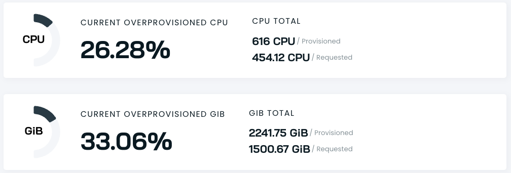
The Overprovisioning percentage indicates how many provisioned resources could potentially be reduced. It is calculated using this formula:
Overprovisioning % = 100% - (Requested Resources ÷ Provisioned Resources × 100%)For example, if you provisioned 688 CPUs and requested only 490 CPUs, the overprovisioning calculation would be:
100% - (490 ÷ 688 × 100%) = 100% - 71.22% = 28.78%This percentage helps quantify potential resource savings through better allocation.
Updated 2 months ago